John Carlo Maula

Data Analyst
I graduated from The Ohio State University with a Bachelors in Data Analytics. I also minored in Mathematics and Epidemiology.
My hobbies include listening to music, baking desserts, and playing video games.
Portfolio
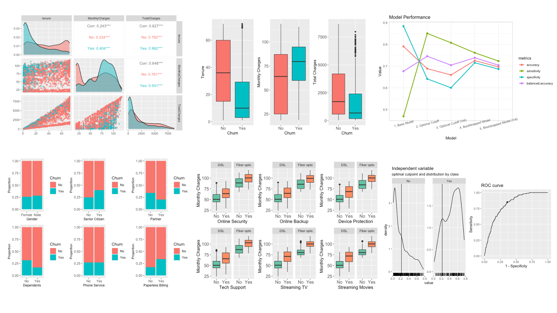
Predicting Customer Churning using Logistic Regression
I analyzed a dataset of telecom customers and built a model to predict churning based on their features. Customers who have a monthly contract, higher monthly charge, and Fiber Optic as their ISP are more likely to churn. With bootstrapping, I was able to build a model with a sensitivity of 72% at the cost of a lower accuracy of 70%, which can be useful for identifying customers who are more likely to churn and implementing appropriate retention strategies.
Tools: R, Tidyverse, Caret
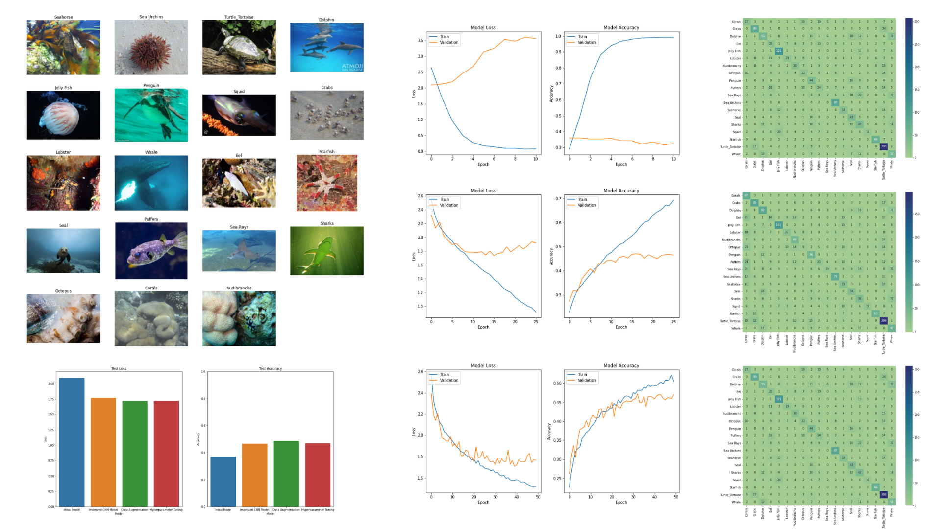
Classifying Images of Sea Animals
I built a convolutional neural network model to classify images of sea animals using a dataset of 11.7k images with 19 types of sea animals. My initial model had a test accuracy of 37%, but by adding more layers and utilizing data augmentation, I was able to achieve an accuracy of 49%. The models generally performed well in classifying turtles/tortoises, sea urchins, jellyfish, crabs, and starfish with F1-scores of 0.62 - 0.80.
Tools: Python, Tensorflow, Scikit-learn, Numpy
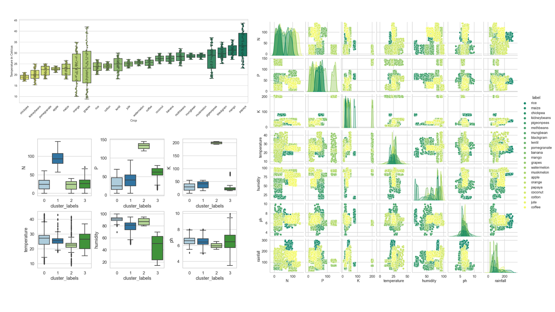
Optimizing Agriculture Production
I used clustering to discover patterns in data of 22 different crops before building a model that recommends a suitable crop to plant given a set of farming conditions for optimal agriculture production. The k-means algorithm did well in determining which crops share similar environmental conditions with NPK ratios and humidity being the most distinguishing variables. Using the random forest algorithm, I was able to achieve 99.9% accuracy in my model.
Tools: Python, Scikit-learn, Matplotlib, Seaborn, Numpy
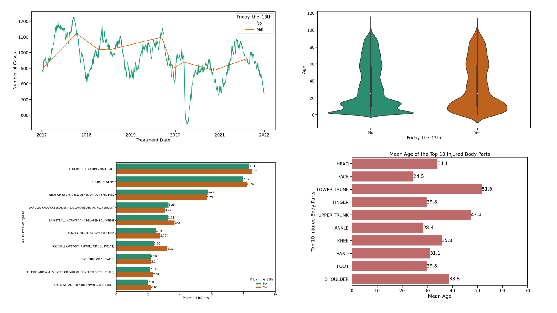
Is Friday the 13th Associated with More Injuries?
I explored the National Electronic Injury Surveillance System (NEISS) dataset from the last 5 years to see if more injuries occur on Friday the 13th, a day associated with bad luck, compared to other days. Out of 1.8 million injuries, only 8,406 occurred on Friday the 13th, which happened 9 times during this time period. Overall, there seems to be no association with the number of injuries and Friday the 13th. It appears to be more associated with the time of year, with more injuries occurring during the summer.
Tools: Python, Pandas, Seaborn, Matplotlib
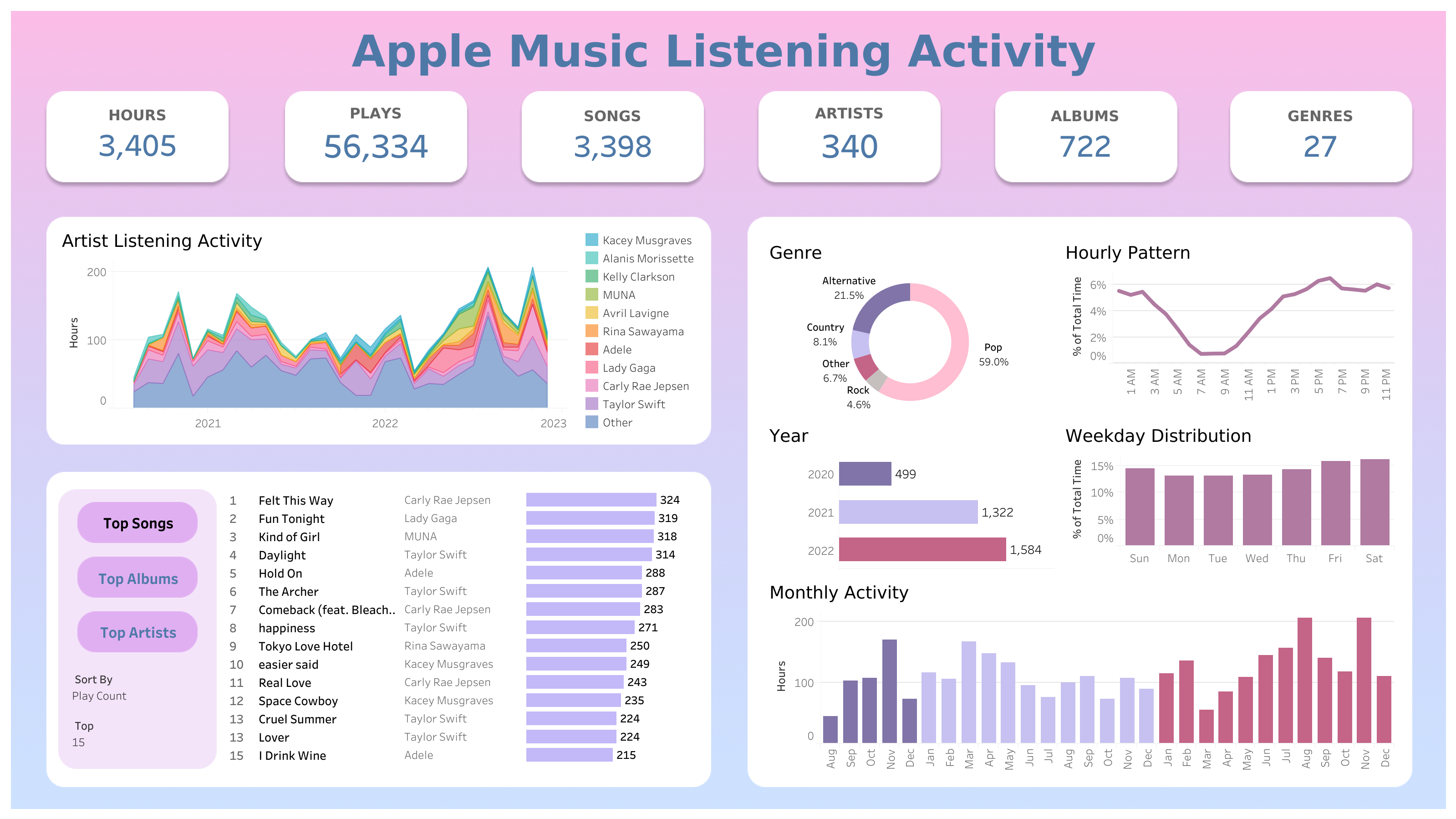
Visualizing My Apple Music Consumption
I built a Tableau dashboard of my Apple Music listening activity from the last ~2.5 years to display a breakdown of my music consumption and my listening habits over time. During this time period, I listened to 3,405 hours of music with Taylor Swift being my most listened to artist at 702 hours. The amount of time I spend listening to music is highly dependent on my favorite artists releasing new music or me discovering a new artist/album I enjoy.
Tools: Tableau, SQL
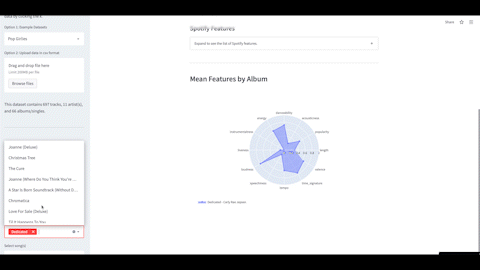
Spotify Features Visualizer Web App
In this project, I developed a web app to visualize Spotify features of music with the option for users to download and visualize their own data. Data can be displayed via interactive plots such as histograms and polar charts with the ability to compare different artists and albums.
Tools: Python, Streamlit, Pandas, Plotly, Spotipy
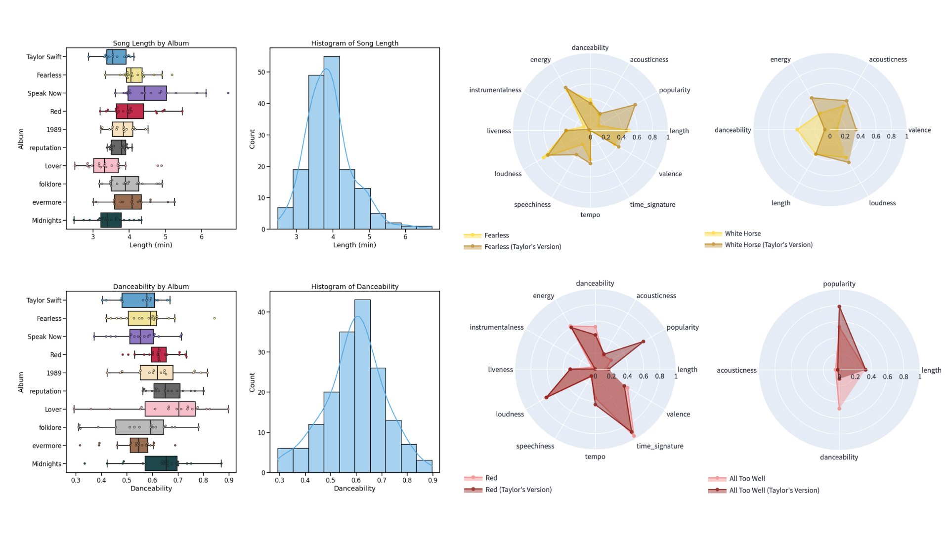
Analyzing Spotify Features of Taylor Swift’s Albums
I analyzed Taylor Swift’s Spotify features to quantify the characteristics of her music and compare her albums. Her country albums had the highest loudness and energy while her pop albums had the most danceability. In addition, her album Lover showed the most variability in these features.
I also developed a web app to compare the features of her re-recordings with the original. As her goal was to capture the essence of the original tracks, the overall features between the two versions remained mostly the same with some minor differences in certain songs.
Tools: Python, Pandas, Matplotlib, Seaborn, Streamlit, Spotipy
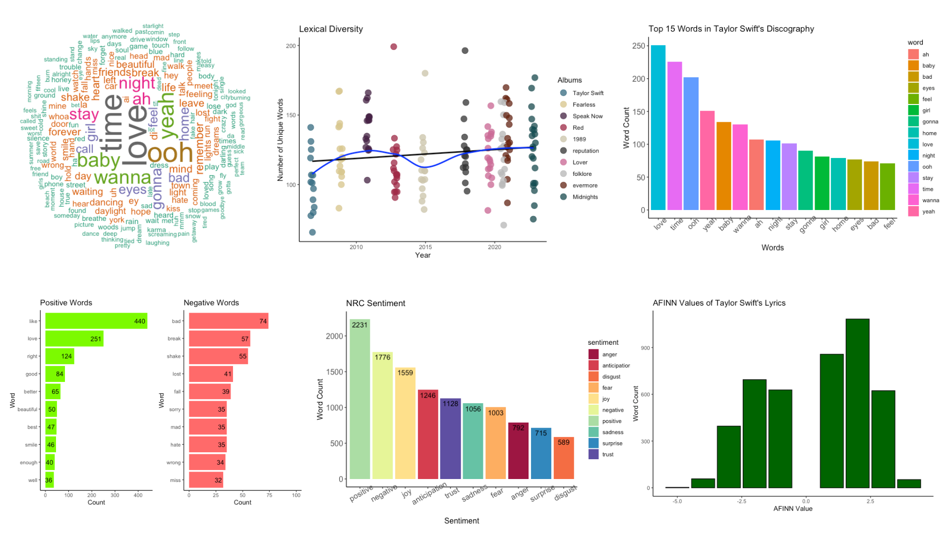
Analyzing Taylor Swift’s Lyrics
I visualized the word frequency and lexical diversity of Taylor Swift’s lyrics and analyzed the sentiments conveyed by her lyrics. I found that her music is primarily about love and relationships with the most common words being “love”, “time”, and “baby”. Her lyrics convey a much more positive sentiment compared to negative, exhibiting her positive outlook toward love and relationships.
Tools: R, Tidyverse